Here's a short article looking at what you can do with iPhone and iPad apps to create images that really pop and leave an impression.
First, we have the original image captured by ProCamera 7, because I use that app to separate Exposure and Focus Point which allows me to expose for the sky and let the shadows go.
Next, I run it through a series of processes in Snapseed to bring back all the detail, texture, colour and light that I saw at the scene. The camera, or rather, the file, actually has all these details, but we have to coax it out of the file and back into view.
So the above, is the benchmark image that then spawned what you see below as it is run through a different app (each time starting with this "pristine" image).
First up is a bizarre little app called Percolator. It's hard to describe exactly how the controls work, and it's best simply played-with. Sometimes ya get something, and sometimes ya don't.
Monokrom is my new favorite B&W conversion app. It's intuitive to use, easy to get results, and the flexibility outdoes all the others.
Moku Hanga recreates the image as a Japanese-style woodcut.
This one uses AutoPainter 3 to render the image as an oil painting in the style of Val d'Orsia.
Tiny Planets folds the image into a planetoid.
Or, conversely, produces a "rabbithole view".
The Seurrat app does a not-really-convincing pointilist version.
Craze is a oil / acrylic media type app.
And the very fun duo of AlienSky and LensFlare yielded this classic:
One of my favorite apps is Painteresque. Here, I've used it to show the image as a lithograph.
I think, though, that this simple, delicate watercolor by Waterlogue is the nicest variation on the theme.
Variety is the spice of life!
Showing posts with label workflow. Show all posts
Friday, 22 August 2014
Saturday, 26 July 2014
In Search of the Holy Grail: Good iOS B&W
With over fifty-years of photography experience, I have a great fondness for black and white images. I grew up shooting, developing and printing B&W, and now with digital, it is even simpler to produce stunning results. Well, on a desktop computer it is, but I've been struggling to get comparable results when processing my iPhone images on my iPhone / iPad using iOS apps.
The above image, shot with the ProCamera 7 app on my iPhone 4S, was processed on my iMac using Photoshop and Nik's Color Efex Pro 4 and Silver Efex Pro 2 software. My workflow starts with Adobe Camera RAW, then entails using Color Efex Pro to prepare the color image using a custom preset I created using the Detail Extractor, Polarization and Pro Contrast filters to bring out detail and contrast. (I like dramatic B&W images, with lots of detail and contrast.) This gives me a file that is then brought into Silver Efex Pro and again, using a custom preset, converted to B&W with a slight Selenium tone. It is this look that I have been trying to recreate in iOS.
I've tried any number of dedicated B&W conversion apps, and they all fall short of what I'm trying to accomplish, so I looked at apps that were more capable, such as Snapseed (which I use for all my colour work), and a new app called Filterstorm Neue. (I have had Filterstorm HD since it became available and it is very capable, but the UI never appealed to me. Filterstorm Neue's new UI solves this issue and it is a very powerful app.) So, with the above image in mind as my goal, here is the workflow for the two apps and the results:
Here is the original iPhone image:
First, we'll look at Filterstorm Neue and follow the flow. Filterstorm Neue's UI consists of menu choices that allow you to easily choose and execute functions.
My first step is the Edit / Tone Map function to bring out texture and "tooth" in the image so that I have a wider range of tones to use for B&W conversion.
Next, I used Levels to help darken down some of the midtones.
Next, a touch of sharpening to bring out more detail.
Now I convert to B&W, using 100% red, 0% green and blue.
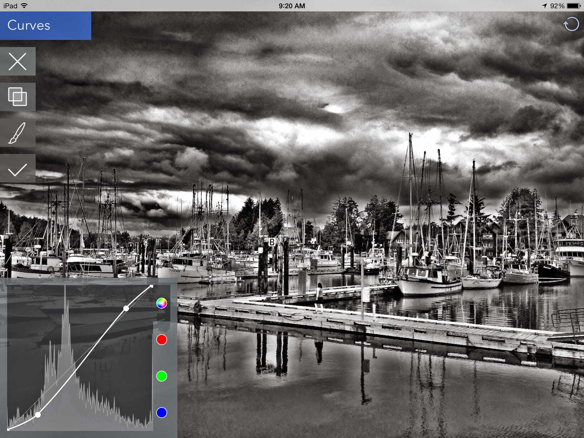
Curves are next to increase the drama a bit more.
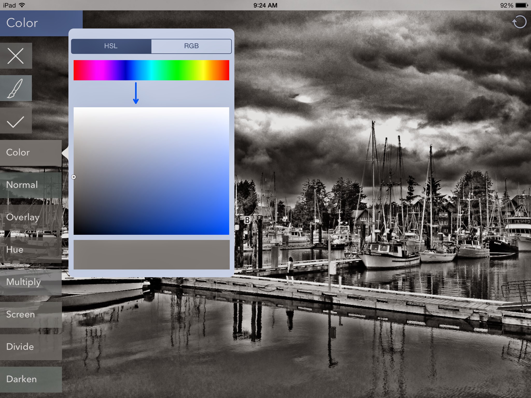
Finally, using the Color function, I chose a bluish-grey tone and used the Soft Light blend mode to try to recreate the selenium tone I like so much.
Here is the result.
While I do like the result, it doesn't have the delicate detail that the Silver Efex Pro version does, nor is the toning correct. So, on to Snapseed...
In Snapseed, I first use the HDR Scape function at 100% to create a tone mapped image.
Next, I used the Ambiance function in Tune Image to bring out some extra toning to increase the palette before conversion.
Then, in the Details tab, I use Structure and Sharpen to increase detail.
Finally, in the Black & White tab, I chose the Dark preset and added a Red filter.
Here is the result:
This method allows me to retain the delicate detail that I was looking for, but again, does not allow me to match the selenium toning look. I am, however, much more pleased with the results than what I get with any of the other apps that tout "the best B&W conversion".
I think more experimentation is called for, and since these methods show potential, especially the Snapseed one, it may simply be a matter of persevering to get a closer result to what I can achieve so easily on my desktop.
EDIT 20140727
I just tried a new (to me) app for B&W processing called Monokrom, which has a really easy to use interface that allows you to specify a tone within your image to use as a base and then adjust contrast and colour tone. I used Snapseed as shown above to prepare the image and then Monokrom to do the conversion and toning. I like the results quite a bit. See what you think:
I think that Monokrom will allow me to get closer to my desktop results, so I'm very happy!
I've tried any number of dedicated B&W conversion apps, and they all fall short of what I'm trying to accomplish, so I looked at apps that were more capable, such as Snapseed (which I use for all my colour work), and a new app called Filterstorm Neue. (I have had Filterstorm HD since it became available and it is very capable, but the UI never appealed to me. Filterstorm Neue's new UI solves this issue and it is a very powerful app.) So, with the above image in mind as my goal, here is the workflow for the two apps and the results:
Here is the original iPhone image:
First, we'll look at Filterstorm Neue and follow the flow. Filterstorm Neue's UI consists of menu choices that allow you to easily choose and execute functions.
My first step is the Edit / Tone Map function to bring out texture and "tooth" in the image so that I have a wider range of tones to use for B&W conversion.
Next, I used Levels to help darken down some of the midtones.
Next, a touch of sharpening to bring out more detail.
Now I convert to B&W, using 100% red, 0% green and blue.
Curves are next to increase the drama a bit more.
Finally, using the Color function, I chose a bluish-grey tone and used the Soft Light blend mode to try to recreate the selenium tone I like so much.
Here is the result.
While I do like the result, it doesn't have the delicate detail that the Silver Efex Pro version does, nor is the toning correct. So, on to Snapseed...
In Snapseed, I first use the HDR Scape function at 100% to create a tone mapped image.
Next, I used the Ambiance function in Tune Image to bring out some extra toning to increase the palette before conversion.
Then, in the Details tab, I use Structure and Sharpen to increase detail.
Finally, in the Black & White tab, I chose the Dark preset and added a Red filter.
Here is the result:
This method allows me to retain the delicate detail that I was looking for, but again, does not allow me to match the selenium toning look. I am, however, much more pleased with the results than what I get with any of the other apps that tout "the best B&W conversion".
I think more experimentation is called for, and since these methods show potential, especially the Snapseed one, it may simply be a matter of persevering to get a closer result to what I can achieve so easily on my desktop.
EDIT 20140727
I just tried a new (to me) app for B&W processing called Monokrom, which has a really easy to use interface that allows you to specify a tone within your image to use as a base and then adjust contrast and colour tone. I used Snapseed as shown above to prepare the image and then Monokrom to do the conversion and toning. I like the results quite a bit. See what you think:
I think that Monokrom will allow me to get closer to my desktop results, so I'm very happy!
Monday, 2 September 2013
Shadow Play
Back in 2005, my wife, Marcelle, and I spent 3 weeks in Paris, and at that time, I was using a pair of Epson R-D1 digital rangefinder bodies with Leica and Voigtländer M-mount lenses. It was a great combination of equipment (well before Leica announced the M8), compact, unobtrusive and capable of producing excellent 6MP images.
My typical shooting practice with these (and most) bodies is to dial in -0.7 EV exposure compensation to ensure highlights are not blown. I also meter for the brightest area, lock the expose and then re-compose as this gives me a file that I can best work with to produce a final image.
This practice can lead to some pretty dark images, but the ability to manipulate RAW images has steadily improved and it is amazing what detail can now be gleaned from these dark treasures. As a case in point, we'll have a look at a file I just returned to from the 2005 trip.
When I looked at the thumbnail in Adobe Bridge, I could see the stained glass windows, but not much else.
When I started to pull up the shadows in ACR, I was amazed to find a figure kneeling in the bottom right corner! Obviously I had seen the person when I took the image, the framing makes that abundantly clear (even if my memory isn't), but they had remained hidden in the shadows.
Since the low-light/high-ISO performance of the R-D1 (which used the Nikon D90 sensor) wasn't great, after ACR, I ran the file through Nik's Define to reduce and eliminate any noise. Next, I presharpened the image in Sharpener Pro and then processed it in Color Efex Pro.
Here's the final version:
As a long time believer of "get it right in the camera", used to using graduated NDs and polarizers etc, I have to say that I've started to do much of this type of manipulation in software now. As long as I make sure that I have nailed the exposure, then using Color Efex Pro (and, of course, Silver Efex Pro) for things like graduated filtering and adding warmth etc are much more easily and accurately done using the U-Point (control point) technology.
In another post, I'll showcase some of the other Paris images that I reworked.
Ciao,
My typical shooting practice with these (and most) bodies is to dial in -0.7 EV exposure compensation to ensure highlights are not blown. I also meter for the brightest area, lock the expose and then re-compose as this gives me a file that I can best work with to produce a final image.
This practice can lead to some pretty dark images, but the ability to manipulate RAW images has steadily improved and it is amazing what detail can now be gleaned from these dark treasures. As a case in point, we'll have a look at a file I just returned to from the 2005 trip.
When I looked at the thumbnail in Adobe Bridge, I could see the stained glass windows, but not much else.
When I started to pull up the shadows in ACR, I was amazed to find a figure kneeling in the bottom right corner! Obviously I had seen the person when I took the image, the framing makes that abundantly clear (even if my memory isn't), but they had remained hidden in the shadows.
Since the low-light/high-ISO performance of the R-D1 (which used the Nikon D90 sensor) wasn't great, after ACR, I ran the file through Nik's Define to reduce and eliminate any noise. Next, I presharpened the image in Sharpener Pro and then processed it in Color Efex Pro.
Here's the final version:
![]() |
| Cathédrale de Chartres |
In another post, I'll showcase some of the other Paris images that I reworked.
Ciao,
Saturday, 31 August 2013
Whistler Interlude
This week, some very close friends of ours from Seattle, invited my wife, Marcelle, and me to join them for a couple of days in a condo in the Upper Village at Whistler that they had rented for the week. The weather as we left the Fraser Valley on Wednesday morning was overcast but had some relatively sunny periods. We stopped off at a couple of places along the Sea to Sky Highway for the viewpoints, and then detoured off to see Alexander Falls.
(Click on pictures for a large size view.)
Lots of colour in the village. The overcast sky provides a beautiful soft light for everything.
My typical tools for photography (for almost a couple of years now) are a pair of Sony NEX 7 bodies that I use with Sony and Voigtländer lenses. For most of these shots, I used the Sony 16mm f2.8 on one body, and my Voigtländer 90mm f3.5 lens on the other. On the night shots, I was using the Sigma 30mm f2.8 and the Sony 50mm f1.8 lenses.
My post processing routine for these pictures is as follows:
I also like using my iPhone 4 for capturing images, and recently, I've been really excited by some of the results I'm getting from the Hipstamatic app. The tintype looks that are possible with the Tinto 1884 lens and D-Type Plate B&W film especially appeal to me.
Here's a few more pictures, from an evening stroll down through the village:
Finally, here's a quick portrait, snapped of our breakfast waitress.
A splendid time was had by all, with great company, excellent food and drink, a fairly spectacular night thunderstorm, and best of all, the chance to catch up with old and dear friends.
Ciao!
(Click on pictures for a large size view.)
Lots of colour in the village. The overcast sky provides a beautiful soft light for everything.
My typical tools for photography (for almost a couple of years now) are a pair of Sony NEX 7 bodies that I use with Sony and Voigtländer lenses. For most of these shots, I used the Sony 16mm f2.8 on one body, and my Voigtländer 90mm f3.5 lens on the other. On the night shots, I was using the Sigma 30mm f2.8 and the Sony 50mm f1.8 lenses.
My post processing routine for these pictures is as follows:
- Where possible, all images start as RAW files.
- All files go into Adobe Camera RAW to adjust for basic exposure, lens distortion and any cropping.
- Files are opened in Photoshop CS5.
- If any noise is evident, it is run through Nik Define.
- The image is then run through the Nik Sharpener's RAW Presharpener.
- Next we're into Nik Color Efex Pro where I use a number of custom presets which consist of various combinations of the following:
- Graduated Neutral Density
- Detail Enhancer
- Darken/Lighten Center
- Brilliance/Warmth
- Glamour Glow
- Vignette Lens
- At this stage, if I am envisioning a final black & white product, I will have used Color Efex Pro to enhance the file for further processing by Nik's Silver Efex Pro. If the final image is to be colour, then this step is skipped.
- Finally, (if necessary) I would use Nik's Sharpener Pro for output sharpening.
I also like using my iPhone 4 for capturing images, and recently, I've been really excited by some of the results I'm getting from the Hipstamatic app. The tintype looks that are possible with the Tinto 1884 lens and D-Type Plate B&W film especially appeal to me.
Here's a few more pictures, from an evening stroll down through the village:
Finally, here's a quick portrait, snapped of our breakfast waitress.
A splendid time was had by all, with great company, excellent food and drink, a fairly spectacular night thunderstorm, and best of all, the chance to catch up with old and dear friends.
Ciao!
Labels:
Hipstamatic,
imaging,
iPhone,
NEX7,
Nik,
Sony,
Voigtländer,
workflow
Subscribe to:
Posts (Atom)