Showing posts with label iPhone. Show all posts

Friday, 22 August 2014

Variations on a Theme

Here's a short article looking at what you can do with iPhone and iPad apps to create images that really pop and leave an impression.

First, we have the original image captured by ProCamera 7, because I use that app to separate Exposure and Focus Point which allows me to expose for the sky and let the shadows go.

Next, I run it through a series of processes in Snapseed to bring back all the detail, texture, colour and light that I saw at the scene. The camera, or rather, the file, actually has all these details, but we have to coax it out of the file and back into view.

So the above, is the benchmark image that then spawned what you see below as it is run through a different app (each time starting with this "pristine" image).

First up is a bizarre little app called Percolator. It's hard to describe exactly how the controls work, and it's best simply played-with. Sometimes ya get something, and sometimes ya don't.

Monokrom is my new favorite B&W conversion app. It's intuitive to use, easy to get results, and the flexibility outdoes all the others.

Moku Hanga recreates the image as a Japanese-style woodcut.

This one uses AutoPainter 3 to render the image as an oil painting in the style of Val d'Orsia.

Tiny Planets folds the image into a planetoid.

Or, conversely, produces a "rabbithole view".

The Seurrat app does a not-really-convincing pointilist version.

Craze is a oil / acrylic media type app.

And the very fun duo of AlienSky and LensFlare yielded this classic:

One of my favorite apps is Painteresque. Here, I've used it to show the image as a lithograph.

I think, though, that this simple, delicate watercolor by Waterlogue is the nicest variation on the theme.

Variety is the spice of life!

Saturday, 26 July 2014

In Search of the Holy Grail: Good iOS B&W

With over fifty-years of photography experience, I have a great fondness for black and white images. I grew up shooting, developing and printing B&W, and now with digital, it is even simpler to produce stunning results. Well, on a desktop computer it is, but I've been struggling to get comparable results when processing my iPhone images on my iPhone / iPad using iOS apps.


The above image, shot with the ProCamera 7 app on my iPhone 4S, was processed on my iMac using Photoshop and Nik's Color Efex Pro 4 and Silver Efex Pro 2 software. My workflow starts with Adobe Camera RAW, then entails using Color Efex Pro to prepare the color image using a custom preset I created using the Detail Extractor, Polarization and Pro Contrast filters to bring out detail and contrast. (I like dramatic B&W images, with lots of detail and contrast.) This gives me a file that is then brought into Silver Efex Pro and again, using a custom preset, converted to B&W with a slight Selenium tone. It is this look that I have been trying to recreate in iOS.

I've tried any number of dedicated B&W conversion apps, and they all fall short of what I'm trying to accomplish, so I looked at apps that were more capable, such as Snapseed (which I use for all my colour work), and a new app called Filterstorm Neue. (I have had Filterstorm HD since it became available and it is very capable, but the UI never appealed to me. Filterstorm Neue's new UI solves this issue and it is a very powerful app.) So, with the above image in mind as my goal, here is the workflow for the two apps and the results:

Here is the original iPhone image:

First, we'll look at Filterstorm Neue and follow the flow. Filterstorm Neue's UI consists of menu choices that allow you to easily choose and execute functions.

My first step is the Edit / Tone Map function to bring out texture and "tooth" in the image so that I have a wider range of tones to use for B&W conversion.

Next, I used Levels to help darken down some of the midtones.

Next, a touch of sharpening to bring out more detail.

Now I convert to B&W, using 100% red, 0% green and blue.

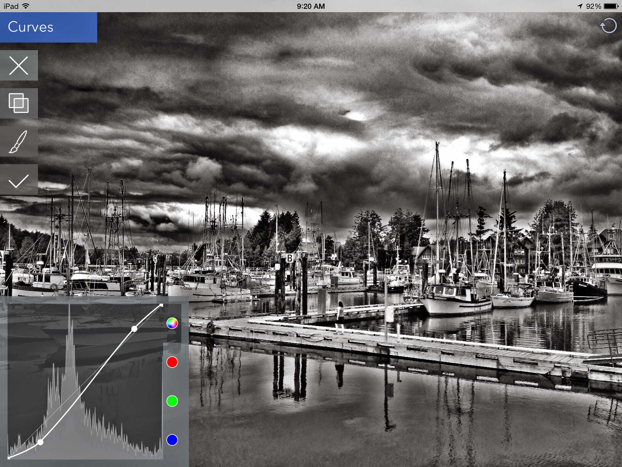
Curves are next to increase the drama a bit more.

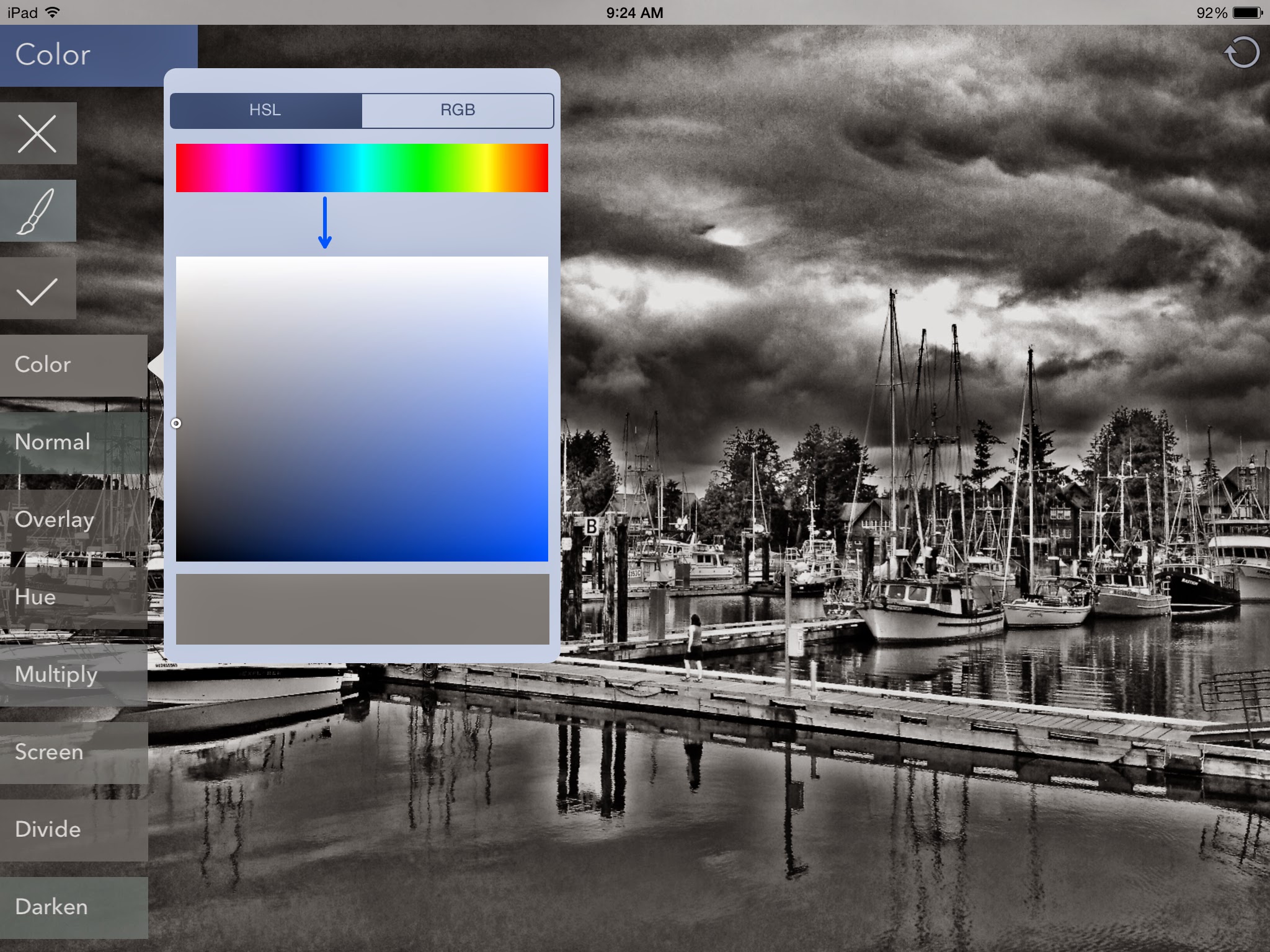
Finally, using the Color function, I chose a bluish-grey tone and used the Soft Light blend mode to try to recreate the selenium tone I like so much.

Here is the result.
While I do like the result, it doesn't have the delicate detail that the Silver Efex Pro version does, nor is the toning correct. So, on to Snapseed...

In Snapseed, I first use the HDR Scape function at 100% to create a tone mapped image.

Next, I used the Ambiance function in Tune Image to bring out some extra toning to increase the palette before conversion.

Then, in the Details tab, I use Structure and Sharpen to increase detail.


Finally, in the Black & White tab, I chose the Dark preset and added a Red filter.

Here is the result:

This method allows me to retain the delicate detail that I was looking for, but again, does not allow me to match the selenium toning look. I am, however, much more pleased with the results than what I get with any of the other apps that tout "the best B&W conversion".

I think more experimentation is called for, and since these methods show potential, especially the Snapseed one, it may simply be a matter of persevering to get a closer result to what I can achieve so easily on my desktop.

EDIT 20140727
I just tried a new (to me) app for B&W processing called Monokrom, which has a really easy to use interface that allows you to specify a tone within your image to use as a base and then adjust contrast and colour tone. I used Snapseed as shown above to prepare the image and then Monokrom to do the conversion and toning. I like the results quite a bit. See what you think:


I think that Monokrom will allow me to get closer to my desktop results, so I'm very happy!

Saturday, 7 September 2013

The Making of a Blog

Although I've had my website for a number of years, having designed and created it myself, I recently decided to add a couple of blogs. The main reason for this is to have a page that I can post to easily from my iPad and, if need be, my iPhone.

As I am a Gmail user, Google's Blogger was the platform I chose to use. Creating the blog account is simple and because I wanted a dark background, I started off with a template called "Travel". At first, I was able to use Blogger's Template Editor to customize the template, but subsequently, access to change things has gone awry (common, and apparently something to do with the Mobile template?!?).

I ended up carrying on the customization process by editing in the HTML editor. (Not too bad once you get your feet wet!) Once the page looked the way I wanted, with a background image, darker main backgrounds and larger fonts, I save it and then backup the XML file. Now, we're ready for posting.

Because I wanted the blogs to be used with mobile devices, I have only posted from my iPad. After doing some web research, I chose Blogsy as my blog editor.

This app is super at making post creation and management as simple as drag-and-drop, and with a built in browser, you can see exactly how the changes look live without having to leave the editor.

Because Blogsy only runs on the iPad, I did purchase BlogPress for the iPhone, but it is nowhere near as visual as Blogsy, so if I need to post images from my phone, I'll just continue to transfer them to the iPad using the PhotoTransfer app.

My own images are typically processed on my iMac and then synced to the iPad from iPhoto and Aperture. From Blogsy, I have direct access to them, and to any photos that I take and/or process directly on the iPhone or iPad.

I actually find it faster to create posts on my iPad than I do through Blogger's web interface.

Ain't technology great?


Friday, 6 September 2013

It's a Small World

The iPad is a truly wonderful device. I can create with it almost anywhere. With the exception that I used a camera to take most of the shots in this post, the final post processing for what you see was all done on the iPad.

The featured app, if you will, is called MarbleCam, and although it's probably considered a 'one-trick pony', it does yield an interesting effect. For these images, I browsed the iPad library of my images and then ran them through the following routine:

  1. MarbleCam (very little to manipulate here)
  2. Perfectly Clear (does a great "first pass" to enhance the image)
  3. Snapseed (further adjustments as needed)
If you're wondering why I didn't run them through Perfectly Clear first, I wanted the backgrounds to be as soft as possible, so I only wanted to enhance it after being marbleized.

Because I couldn't post images as a grid from my editor (Blogsy), I created single images of a 3x3 grid using an app called PicFrame. These I could easily paste into the blog.

I love the little worlds you can create using MarbleCam...


(The top-left and bottom-right in this matrix features processing the image with the Craze app before 'marbleizing'.

The most effective images seem to have the horizon in the middle to get the best "reflection".


Ciao for now,


Saturday, 31 August 2013

Whistler Interlude

This week, some very close friends of ours from Seattle, invited my wife, Marcelle, and me to join them for a couple of days in a condo in the Upper Village at Whistler that they had rented for the week. The weather as we left the Fraser Valley on Wednesday morning was overcast but had some relatively sunny periods. We stopped off at a couple of places along the Sea to Sky Highway for the viewpoints, and then detoured off to see Alexander Falls.

(Click on pictures for a large size view.)


Lots of colour in the village. The overcast sky provides a beautiful soft light for everything.


My typical tools for photography (for almost a couple of years now) are a pair of Sony NEX 7 bodies that I use with Sony and Voigtländer lenses. For most of these shots, I used the Sony 16mm f2.8 on one body, and my Voigtländer 90mm f3.5 lens on the other. On the night shots, I was using the Sigma 30mm f2.8 and the Sony 50mm f1.8 lenses.

My post processing routine for these pictures is as follows:


  • Where possible, all images start as RAW files.
  • All files go into Adobe Camera RAW to adjust for basic exposure, lens distortion and any cropping.
  • Files are opened in Photoshop CS5.
  • If any noise is evident, it is run through Nik Define.
  • The image is then run through the Nik Sharpener's RAW Presharpener.
  • Next we're into Nik Color Efex Pro where I use a number of custom presets which consist of various combinations of the following:
  1. Graduated Neutral Density
  2. Detail Enhancer
  3. Darken/Lighten Center
  4. Brilliance/Warmth
  5. Glamour Glow
  6. Vignette Lens
  • At this stage, if I am envisioning a final black & white product, I will have used Color Efex Pro to enhance the file for further processing by Nik's Silver Efex Pro. If the final image is to be colour, then this step is skipped.
  • Finally, (if necessary) I would use Nik's Sharpener Pro for output sharpening.

I also like using my iPhone 4 for capturing images, and recently, I've been really excited by some of the results I'm getting from the Hipstamatic app. The tintype looks that are possible with the Tinto 1884 lens and D-Type Plate B&W film especially appeal to me.


Here's a few more pictures, from an evening stroll down through the village:


Finally, here's a quick portrait, snapped of our breakfast waitress.


A splendid time was had by all, with great company, excellent food and drink, a fairly spectacular night thunderstorm, and best of all, the chance to catch up with old and dear friends.

Ciao!


Welcome!

This blog will be used to present various art-related thoughts I have. My various loves include photography, writing, music, cooking, reading and beach walking. Any of these themes will be fair game from this blog.
Welcome and I hope that you enjoy some of the things that I find fascinating. Please visit my photography website too.

Cheers!